Work
The fun with branding is making an impactful difference in people's lives.
Our work showcases how we partner with clients, diving deep into their vision to create brands that feel personal, authentic, and memorable. From logos to full brand identities, every project reflects a blend of creativity, strategy, and connection. Here’s a look at how we bring brands to life, one unique story at a time.
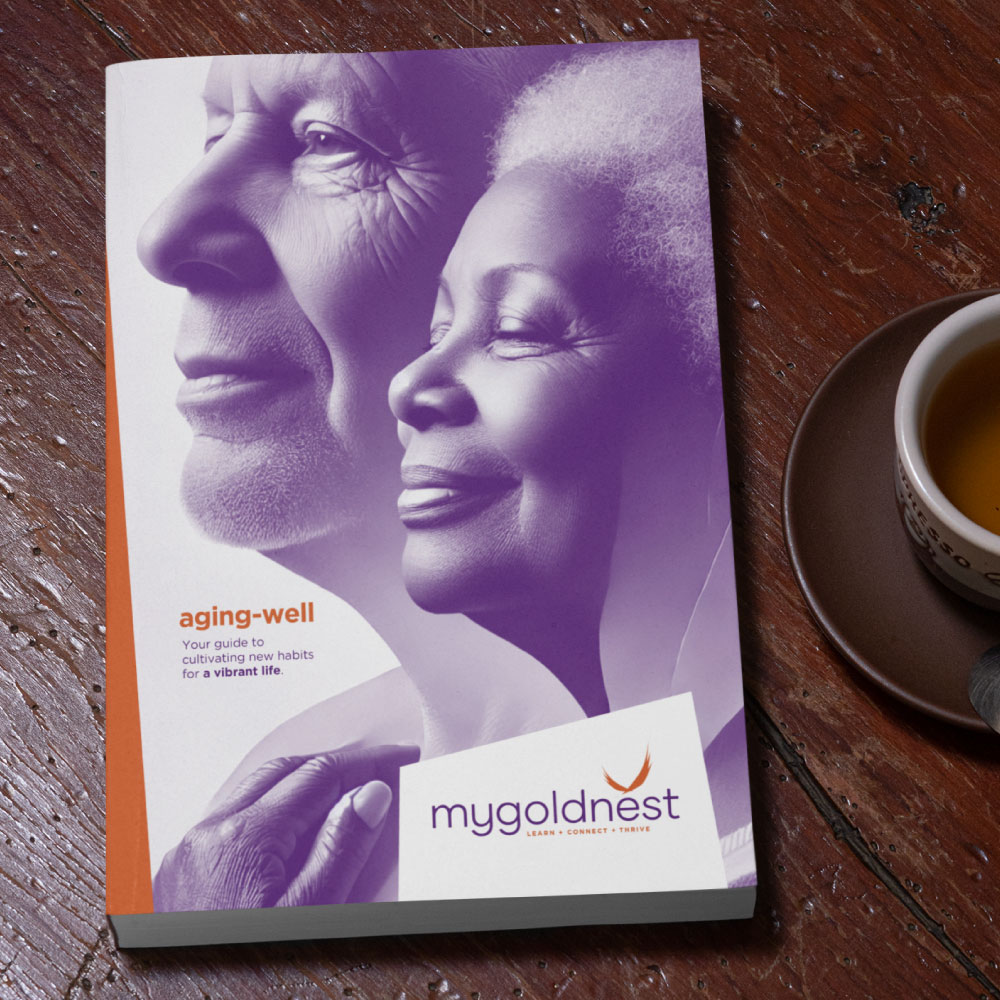
My Gold Nest
Brand Identity, Design & Web
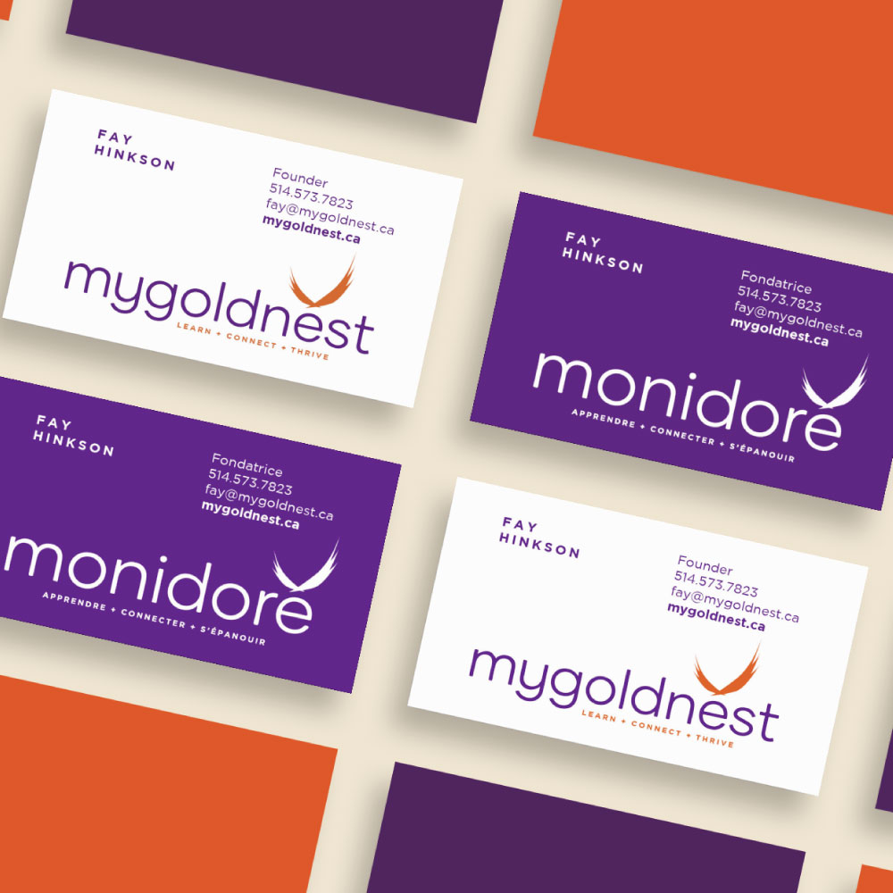
Our approach focused on creating a warm, uplifting visual identity that resonates with the elderly audience while maintaining a vibrant, modern feel. The purple and orange colour palette is energetic yet calming, reflecting the brand’s focus on well-being and community. The logo features a bird in flight, symbolizing freedom, growth, and the thriving spirit of aging well. The design is clean and approachable, making the brand feel both trustworthy and engaging for its target audience.
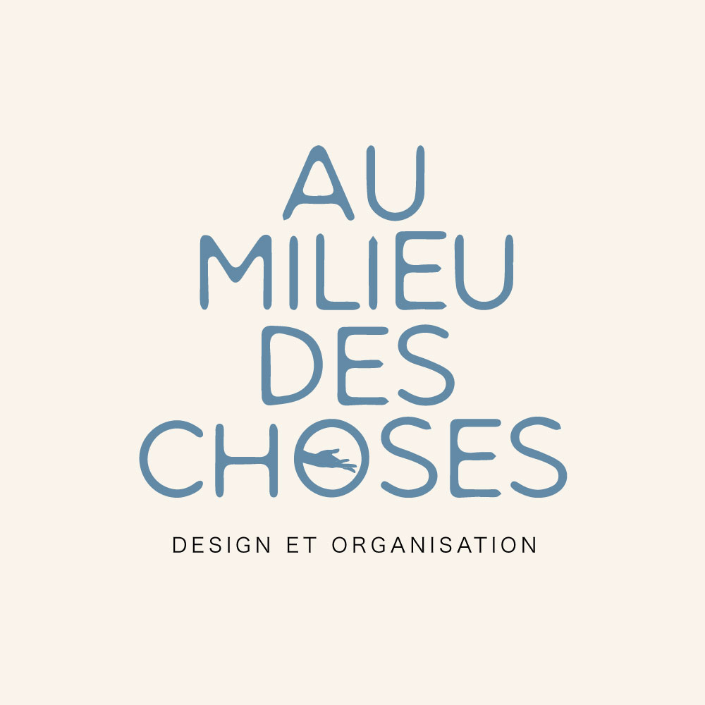
Au milieu des choses
Brand Identity, Design & Web
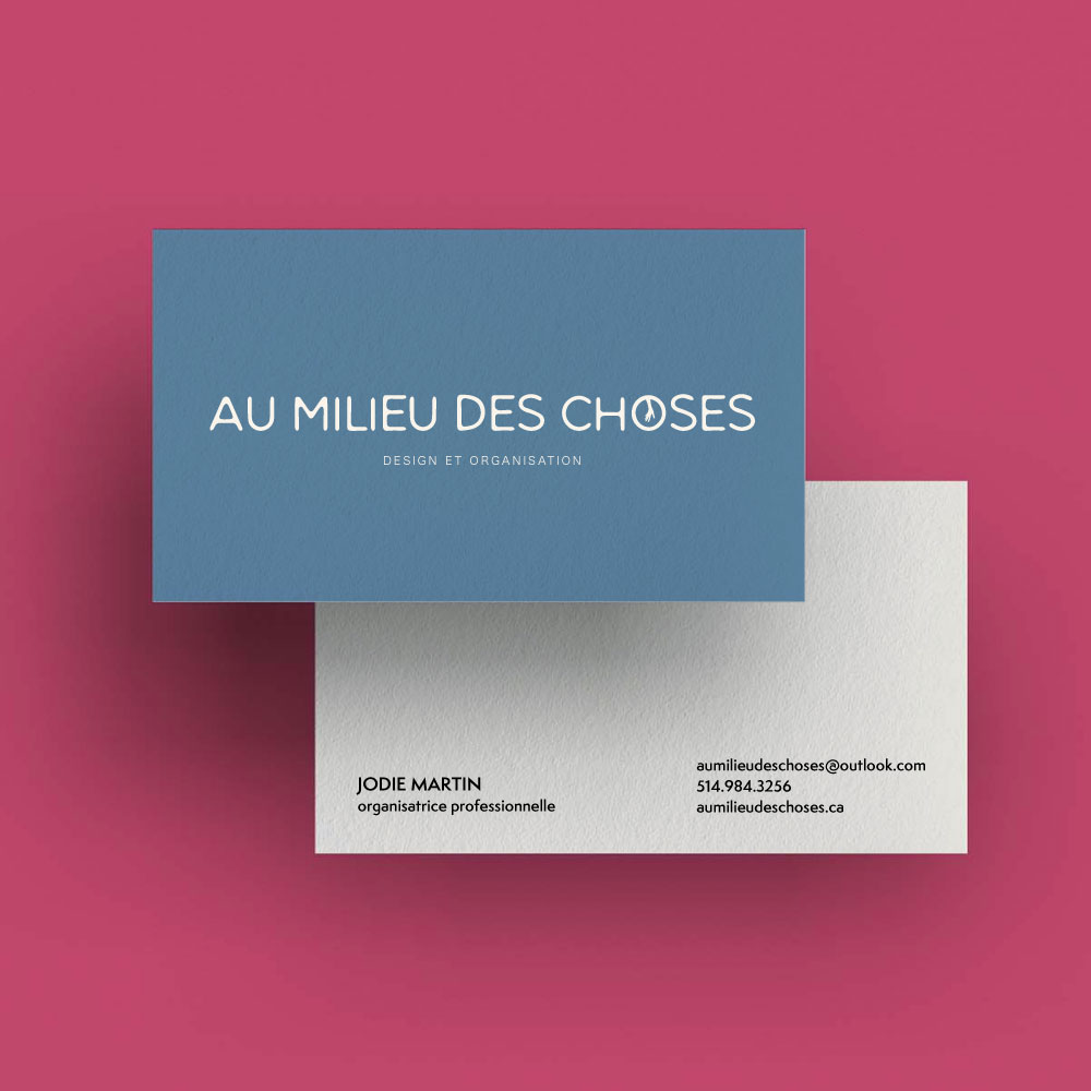
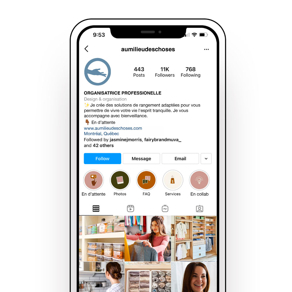
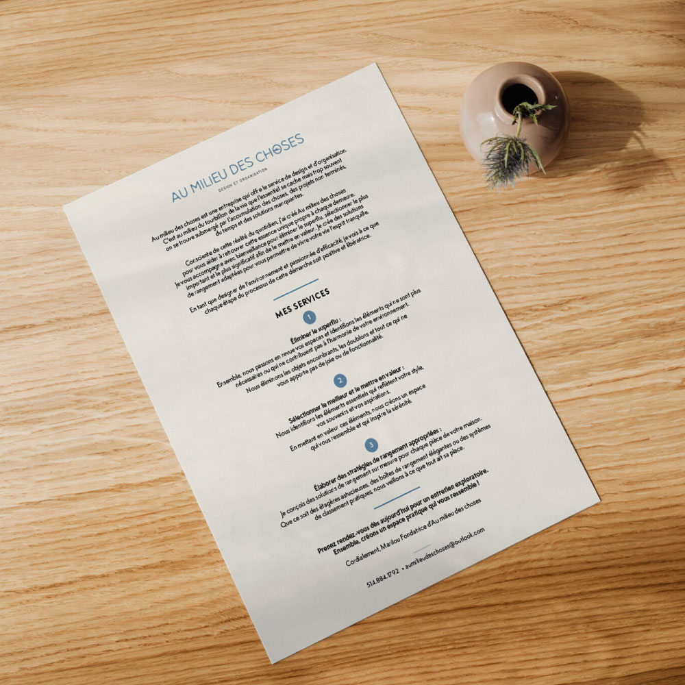
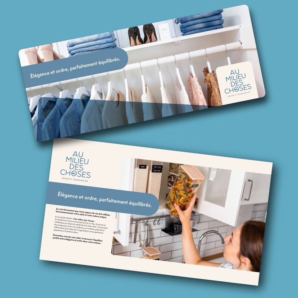
We crafted a brand identity that speaks to the busy and distinguished client. The visual elements combine sophistication with a sense of calm, emphasizing balance and organization. The hand icon in the logo represents the personal touch and attention to detail, while the soft color palette and elegant typography reflect a premium, tailored service. From business cards to digital assets, the cohesive design communicates a professional, approachable, and efficient service designed to bring order to chaotic spaces with style and ease.
RBE
Brand Identity, Design & Web
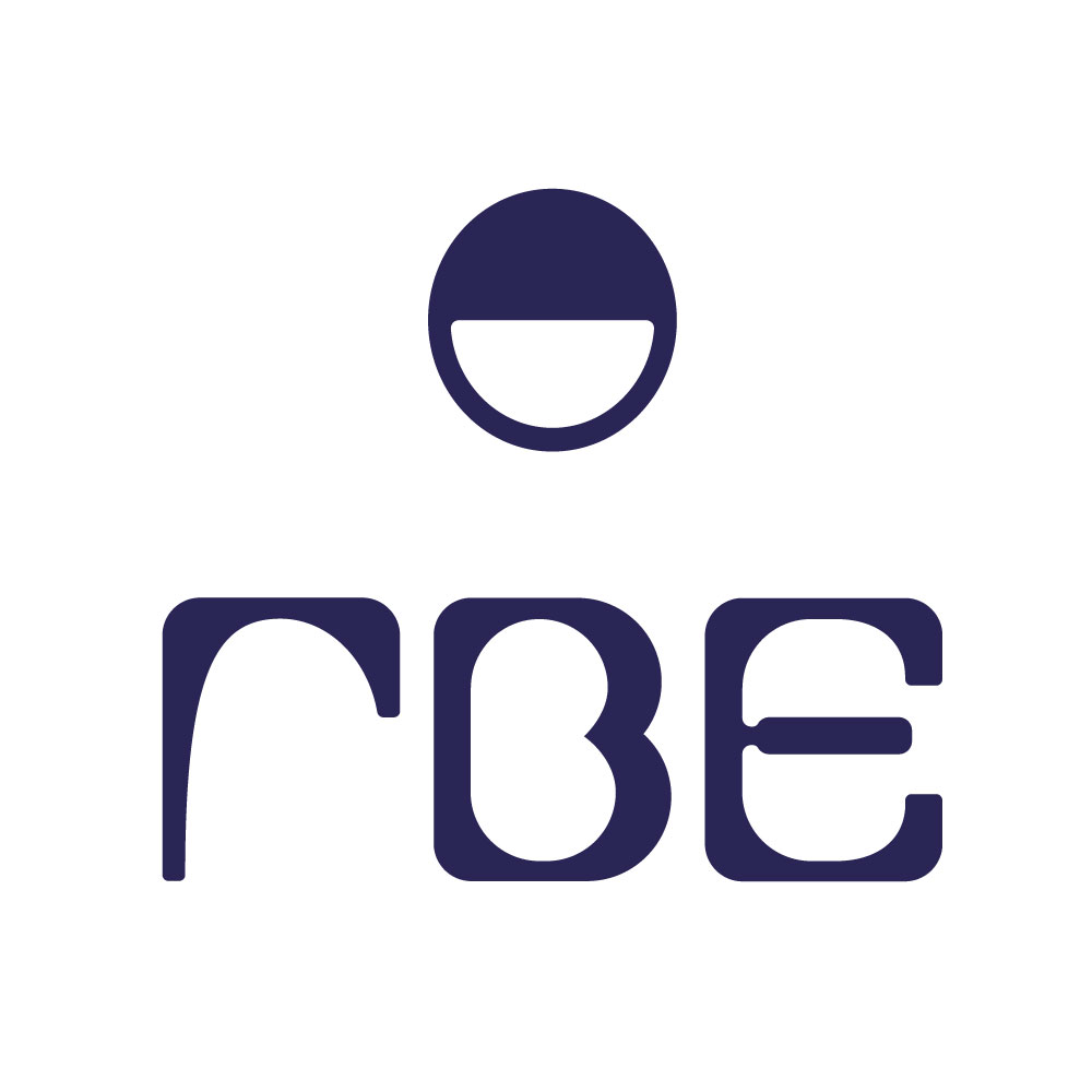
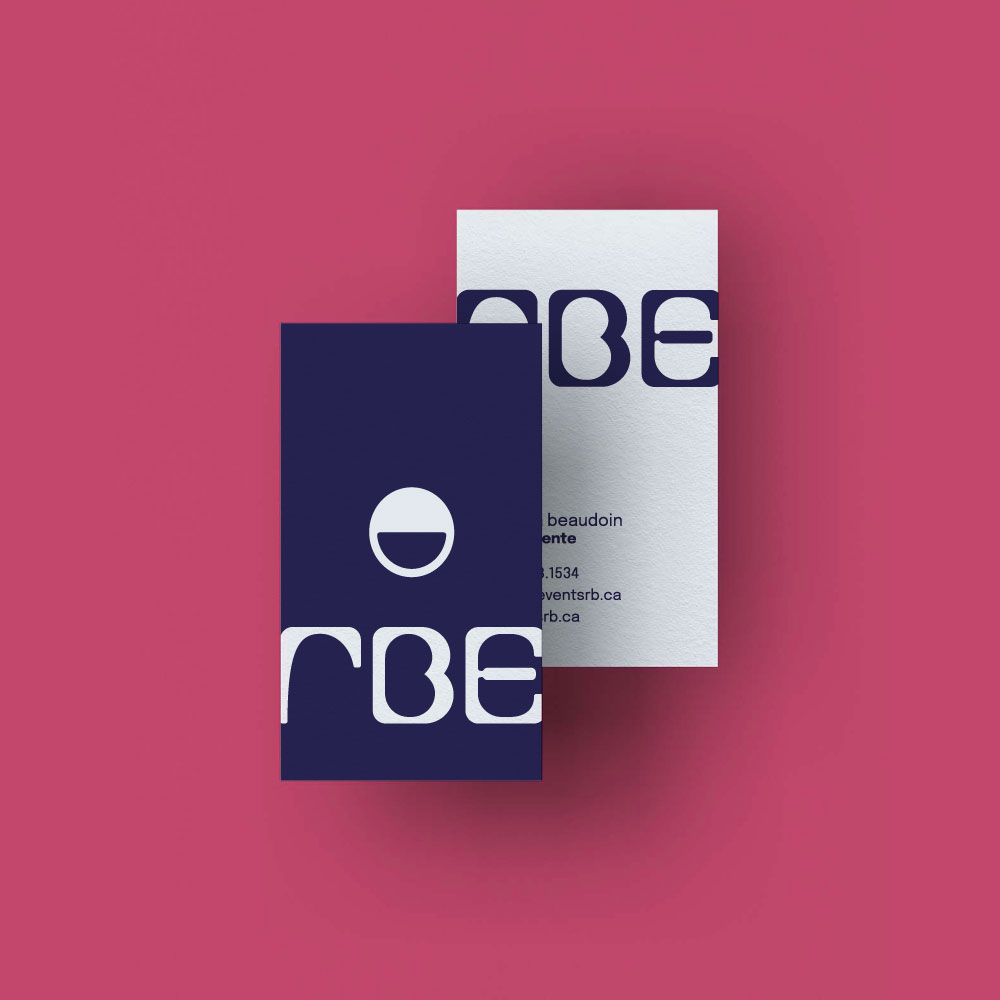
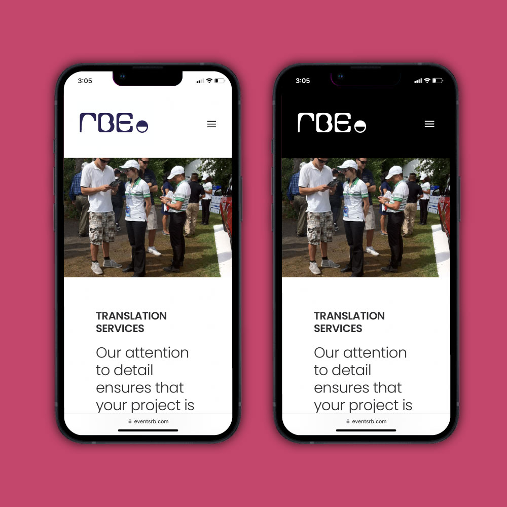
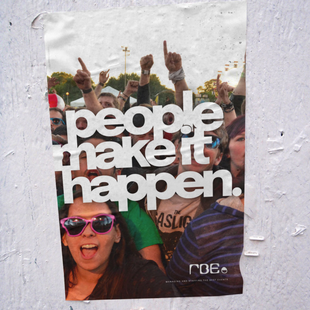
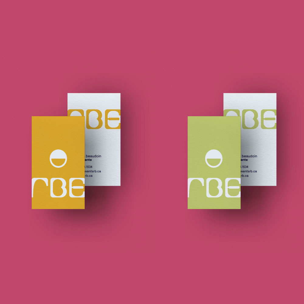
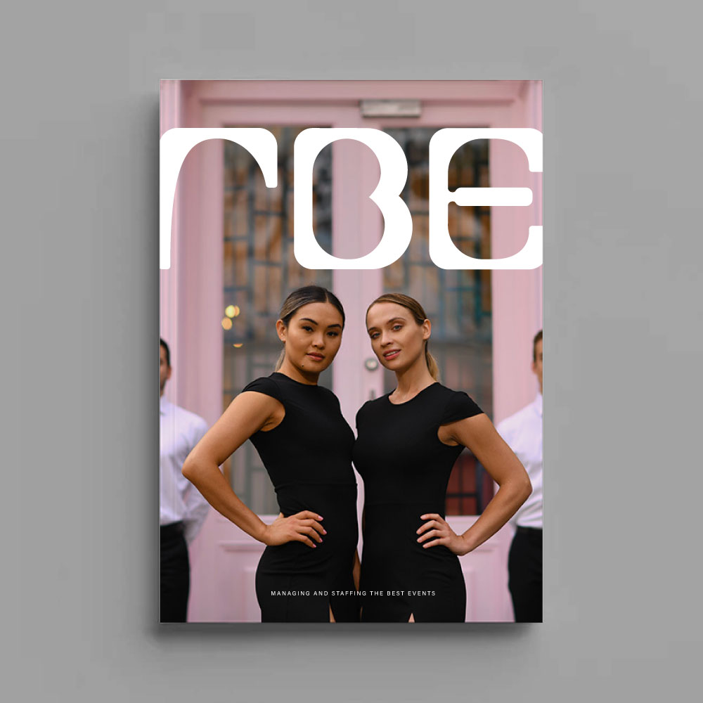
For the rebranding of RBE, an event staffing agency catering to luxury brands, we created a bold and modern identity that reflects their industry status. Our work on the new logo features clean, rounded typography paired with a minimalist icon, conveying professionalism with a touch of playfulness. The vibrant colour palette and sleek design of the business cards, poster, and website create a striking, high-end aesthetic, while the overall branding maintains a sense of approachability and energy, perfectly suited for a company known for managing premier events.
Sophie Hypnose
Brand Identity, Design & Web
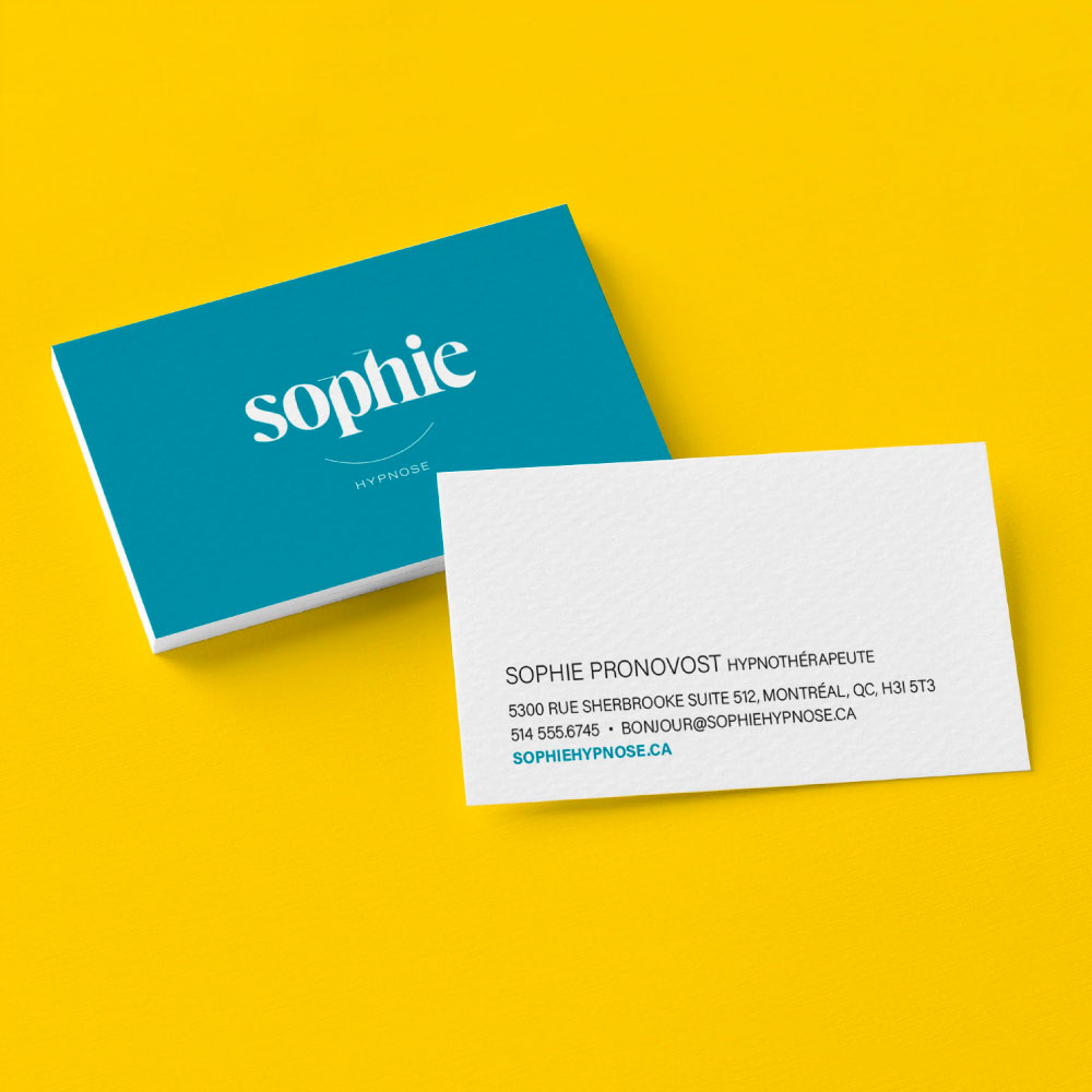
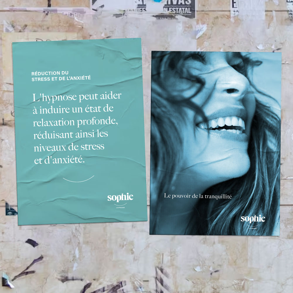
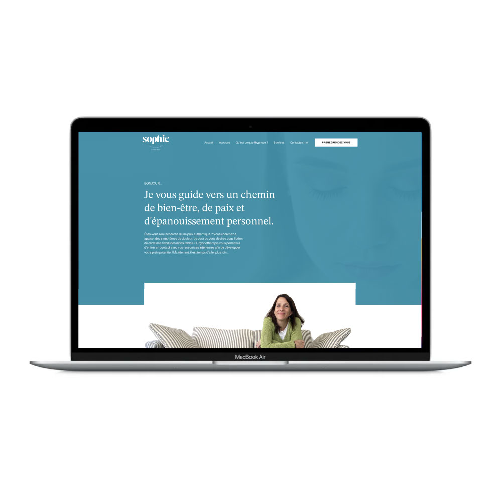
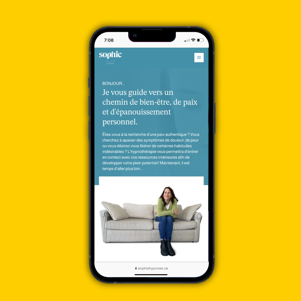
Our work on Sophie Hypnose’s branding focused on creating a friendly, inviting identity that reflects the supportive nature of hypnotherapy. The logo’s curved design subtly mimics a smile, fostering an immediate sense of trust. Paired with a soothing colour palette, this warmth extends across the business cards and website, and every touchpoint, ensuring every interaction feels approachable and aligned with their mission to guide people toward peace and personal growth.
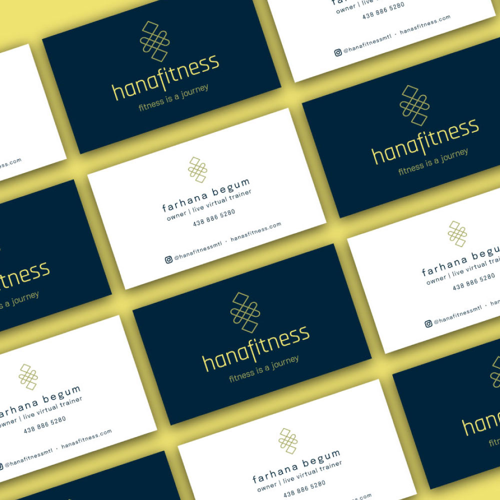
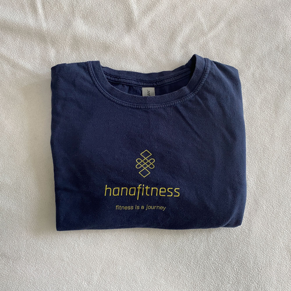
Hanafitness
Brand Identity
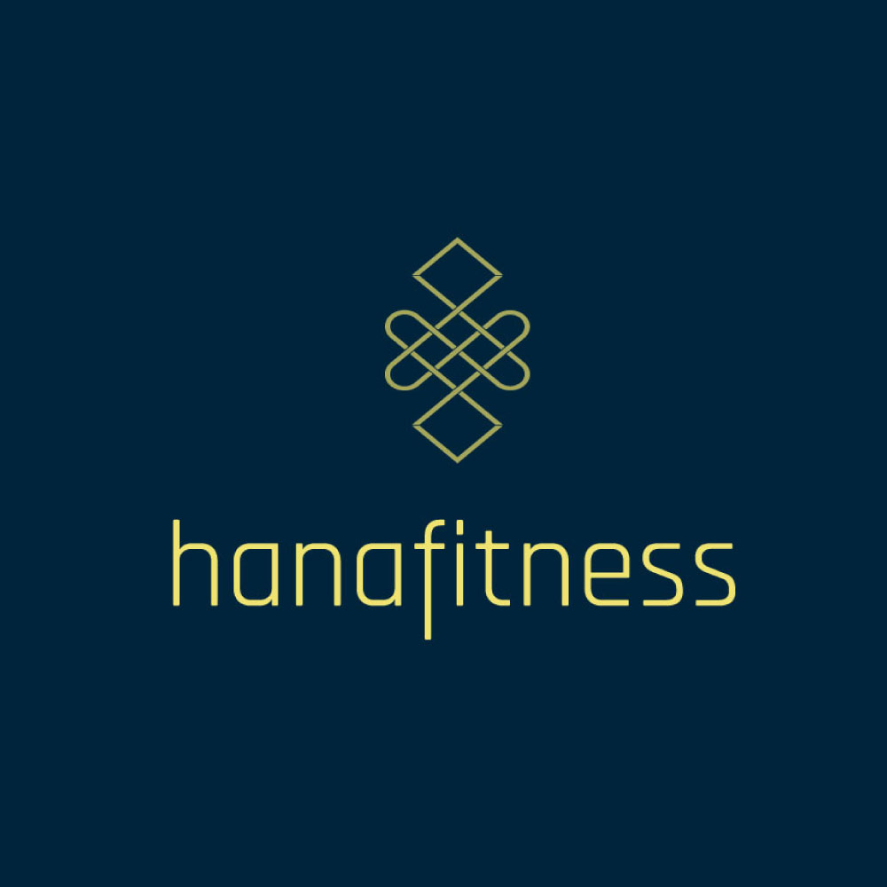
Hanafitness provides live virtual full-body workouts for women wanting convenient and accessible fitness programs designed for their ultimate wellbeing. The goal is to support and empower all women so that they can live stronger & healthier lives. We designed an identity that reflects the personalized connection and empowerment that Hanafitness strives to provide to its clientele. Beautiful and slick, centred and focus, calm and personal.
Octolux Studios
Brand Identity
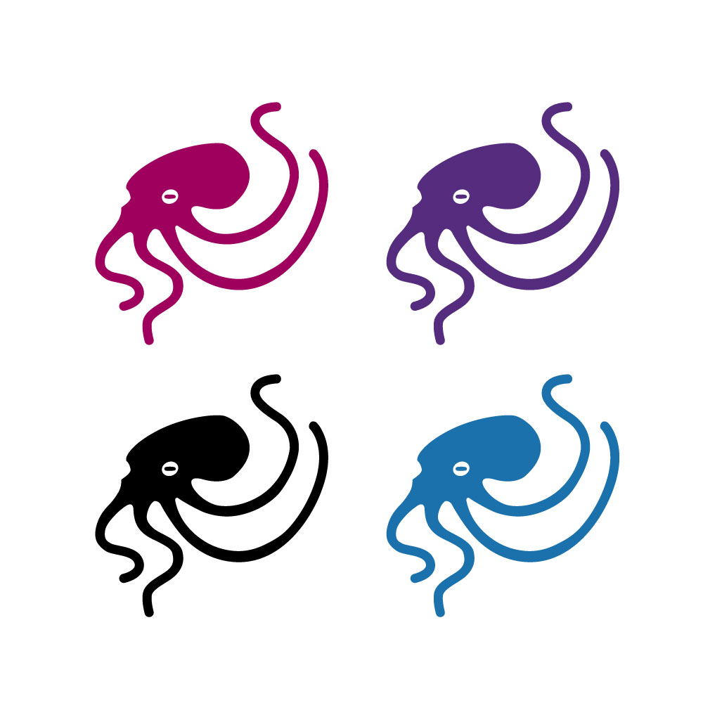
We designed a vibrant, playful logo to reflect the studio’s creativity and immersive storytelling. The octopus icon represents adaptability and depth, qualities mirrored in the indie games they create. The bold, curvy font adds a sense of adventure and whimsy, making it visually engaging while still professional. The magenta color palette adds energy and excitement, capturing the spirit of the studio’s innovative approach to game design. Overall, the visuals embody the dynamic and imaginative essence of Octolux.
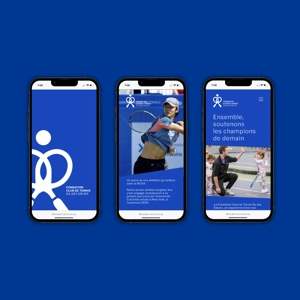
La Fondation Club de tennis Île des Sœurs
Brand Identity, Design & Web
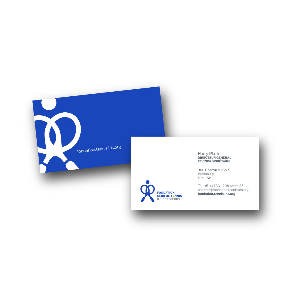
We crafted a brand identity that reflects excellence, professionalism, and a strong sense of community. The X-shaped rackets symbolize unity and collaboration, while the ball above conveys the dynamism of tennis. The logo’s confident standing figure represents young players’ determination, while the heart-shaped curves formed by the rackets embody a love for tennis and the club’s community spirit. Our design encapsulates the foundation’s mission to nurture the next generation of tennis champions, promoting camaraderie and excellence within the sport.


